I have come up with an initial idea for my production company Ident.
I thought that I could have a drop appearing from a stalectite, located in an eerie cave, which drops to the floor and as it does so, a burst of light appears showing the company's name. The idea reflects the sort of mysterious, thriller genre which I am considering to persue.
I used the image below as a sort of template for the setting of my ident.
I am yet to decide a name for my production company, however I have begun to play around with ideas, as I am currently working on the idea of the water dropping and bursting into light.
This exercise involved filming a short sequence which involved the addition of foley sounds. I have found that, throughout some of my other filming tasks, that background noise has quite a large effect on the quality of the sound that is produced. Therefore, this exercise is important as I have been able to practice this skill in preparation for my final AS piece.
What I found good about the use of foley sounds was that you can manipulate them into anything you want. For example, in this piece we came up with the idea of 'fart shoes' as the product demonstrated to the Dragon's Den. In addition, you can introduce other sounds, such as a voice over of a previously recorded voice recording, which allows you to be a lot more creative than without it.
Note to self: Foley work is crucial for a professional, clearer sounding film. I will need to incorporate this into my own work.
I have been researching three idents from three different production companies, in preparation for my own original ident.
Warner Brothers Pictures production company
Firstly, I looked at the Warner Brothers ident. The beginning of this ident involves a shot of warehouses, in a wavy sort of effect with a tangy orange tint. The connotations of this include a dreamy state of mind, which may have a link towards the type of film genre that this production company will be promoting. Furthermore, the industrial side of this section of the ident suggests a sense of reality and the process of which is taken to produce these films.
Another section of this ident which interested my was the use of a logo, which in this case has made this ident incredibly notorious as a successful production company. The logo actually involves a rather simple design. The golden boarders and text make it almost powerful, and the blue background, along with the sky, connote freedom and therefore making it eye-catching and easy to watch. The use of a logo is certainly something which I will think about when creating my own ident.
Universal Picture
The second ident I looked at was the Universal Picture's, which, in my opinion, is one of the greatest and well known in the film industry. Whenever I see this ident at the beginning of a film, I know the film is going to be good.
This ident includes something which everyone can recognize and relate to - the earth. This is one of the things, in my opinion, which makes this ident so remarkable. The use of something which someone can relate to is something which i am keen to use in my own ident. Also, the use of bold, 3D text also makes this ident stand out and be recognizable.
Channel 4 idents
I personally find these idents extremely effective. To start with, the quirky, clever alignments of objects to produce the '4' shape is incredibly original and recognizable.
For example, this ident uses street signs and lights to produce the shape.
These idents are very different from the ones I previously researched, because, firstly, I feel they're much more 'down to earth' - in some cases quite literally. For example, the Universal Pictures ident has this sort of Sci-fi, extraterrestrial feel to it. Similarly, the Warner Brothers Pictures ident has a sort of cartoony feel to it. This ident is in contrast, which made me realize there is an almost unlimited number of ways in which I could create my ident. Also, it includes the busy urban feel, which allows many of us to relate to it. This could link with the type of media which follows on from this ident. For example, the ident suggests a documentary will follow, as reflected by the 'down to earth approach'.
In this exercise, we tried to re-create the opening of the Teletubbies using Adobe After Effects. We started by mimicking the shape of the sun, using the pen tool and a blurring effect. We also masked the shape of the baby's head, to make it more accurate to the real thing. To make the shapes of the sun and the baby move at the same time, I used the parenting tool which enabled the shapes to move in sync with the face. This therefore enabled me to use a transition on all of the shapes at once. Another effect I used was the rotation of the sun's rays and the change of opacity of the baby's face. I did this not only to make it more like the real thing, but to make it more interesting and less monotonous. I also changed the opacity of the background as the sun rose, therefore making it seem like the sky is lighting up.
The addition of text was an original idea, which I introduced as it would be more true to my own future title sequence. I used the transition of the text, again, in preparation for my final film opening, as it is something which I am keen to use in it.
If I was to do this task again, I would spend more time on the continuoual development of the sequence to make it seem more professional and seamless.
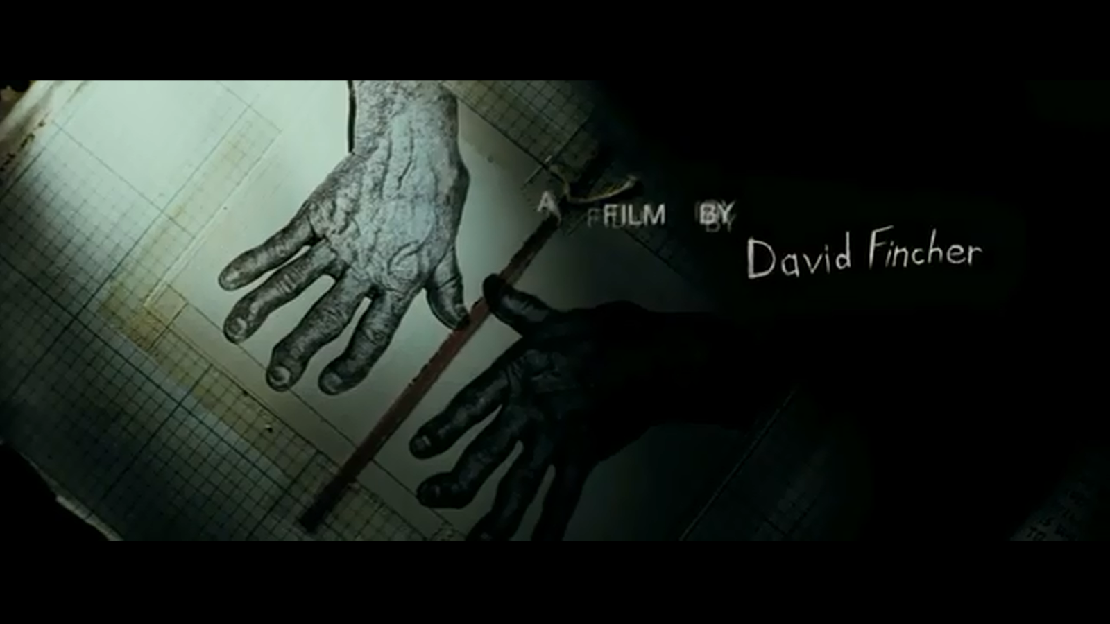
David Fincher Approaches his title sequence work by believing that "it's as much about it being a good title sequence as it is being a movie . This means he wants the title sequence to be part of the film. For example, his title sequence for Se7en provided important non-narrative information regarding the plot of the movie - such as setting and characters. He also believes they should almost be a sort of teaser into the film, enticing the viewer into the whole scenario.
Examples of this include his work on title sequence for Se7en. The beginning of the sequence shows someone turning the pages of a book, which could perhaps reflect the beginning of a story.
He also goes on to say in his interview, "I don't believe in decorative titles", and wants to make sure you get your "bang for your buck". This suggests he wants to provide action and get straight to the point, without the attractive titles or colours.
David also states how his work has been influenced by Saul Bass, of whom we have studied previously. His work on "North By Northwest" really got him thinking about different ways in presenting information, which he states in his interview.
Se7en
The first shot of this title sequence is a close up of an old, worn out book.
This suggests there's a history behind the book, and there's perhaps more to it than meets the eye. Plus, the camera is focused on the book, as shown by the blurry background where only a silhouette of a hand can be seen throughout the shot. The connotations of this include mystery, which leads us into the thriller-style genre. The audio in the this scene is sustained and eerie which backs up the idea of a thriller genre. The next shot breaks into a pitch-black background with rather disturbing fonts for the production details. This font seems quite disjointed and disturbing, plus it looks to be someone's handwriting, which leads the viewer think who the handwriting could belong to. Plus, the shot is backed up by the sound of thunder as the transition takes place. This sudden change in dynamic perhaps links to the film's unpredictability, and the sound of thunder connotes darkness and evil in present.
Then there's a cut to a pair of dis-figured hands on sheets of paper. The hands are extremely off-putting and gruesome, which again connotes darkness. The shadowing as well, on this shot, suggests there's perhaps someone there, but out of sight of the viewer. This leaves the viewer confused and perhaps disturbed that there may be someone there, but they are unable to see who.
The title sequence then goes on to show a montage of extreme close-ups of tools, but the cuts are so fast that we are unable to make out exactly what they are. This connotes mystery and suspicion as you are left wondering what this person may be up to, and why.
The disjointed and disturbing tone of this title sequence portrays a world of dark secrets and indescribable dis-comfort. The character is clearly troubled some sort of past event, which allows us, as the viewer, to predict what the film may contain.
This activity involved researching some of the Title Sequences Saul Base has created.
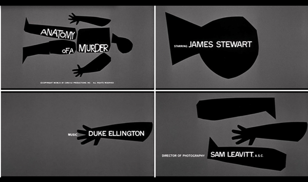
Firstly, am I going to analyse the Title Sequence of Anatomy Of A Murder (1959).
The first aspect of this Title Sequence I noticed was the use simplicity. This is a major aspect of Bass's work, as shown throughout all of his title sequences which I have studied. The use of very limited colour; black and grey, connotes a feeling of mystery as it's not giving much away. This links with his Title Sequence for Psycho as the same technique is used there. As well as that, the use of a silhouetted body part reflects death or murder. Plus, the use of the title of the film being embedded within the silhouette is again, a hint towards a murder-mystery thriller. This, in my view, makes this Title Sequence a successful one.
This Title Sequence also uses background music, which includes many brass instruments playing high-pitched, disorientating notes. The music is also in free-time, until 50 seconds into the sequence. This suggests the to viewer that there is no pattern, perhaps linking to the mystery and suspicion that will be involved in the film. Therefore the music, in my view, is a good asset to the title sequence as it backs up the idea which is created by the graphics. I am very keen to use this idea within my own Title Sequence.
I am also going to analyse another Title Sequence created by Saul Bass for the film North By Northwest (1959).
Again, the start of this Title Sequence reflects the idea of simplicity as the plain green background doesn't really give anything away, and the introduction of straight lines is an intriguing aspect. In addition, the 3D effect may also create a sense of disorientation, which connotes the confusion which could be created in the film. It also adds depth to the sequence, perhaps reflecting the complexity of the film. Another aspect I found interesting is the transitions of the text - vertical transitions, in my opinion, creates a sense of mystery as you are unsure where the text has gone, and whether it's going to return. There is also huge emphasis on the text, as the plain background offers no other visual outlet. As the sequence progresses, the background begins to fade into a visual match of an urban office block, which brings the viewer back to reality.
As well as that, the second shot (of which involves a lap dissolve) puts the viewer almost within the action of the city. The height of the shot almost provides a POV shot of someone in the scene, as well as setting the scene for the film.
Music plays a huge role in this title sequence. Even from the start; fast, high-pitched motifs are played to connote an exciting yet perhaps sinister feel. Also, a range in dynamics is used in the sequence, as a gradual build up allows the viewer to feel vulnerable, due to an increased tension.
The final Title Sequence I am going to analyse is Bunny Lake Is Missing (1965)
The first thing I can note about this title sequence is the almost soothing tone of it. A quiet melody line is played at a leisurely pace, which connotes no real confusion or danger. However, the sharp ripping sound of the paper really stands out, which contrasts the accompanying music.
Plus, the graphics in this title sequence are really eye catching and intriguing. The ripping and tearing of the paper connotes a feeling of searching for something or that something's missing, which keeps the viewer intrigued as you are unsure of what may lay behind the paper. Also, the use of black connotes mystery, whereas in contrast, the revealed white connotes safety and innocence. This could reflect the character's state of mind as they're trying to tear their way through a dark, mysterious event to reach the security of the place beyond it.